Goodbye Lime Green, Hello Elegant Purple – A Rebrand Built on Growth
- Roman Schurter
- No Comments
Change is good. Change is growth. And sometimes, change means swapping neon for something a little more… sophisticatedly purple.
As we head into 2026, Get More Brain is showing up with a fresh new look. But before we unveil it, let’s rewind for a moment – because every rebrand has a backstory, and ours includes a tree-brain hybrid and some very enthusiastic color choices.
The Original Vision: Growing Brains in Speech Bubbles
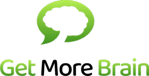
When Get More Brain first launched, our logo was impossible to miss: a vibrant tree – or was it a brain? (Yes.) – inside a speech bubble, all in peppy neon colors that could probably be seen from space.
The symbolism was earnest and clear: growth, knowledge, community. The tree stood for learning that expands organically. The brain hinted at cognitive development. The speech bubble signaled sharing and collaboration. In short: “grow your brain – and share it.”
It was bold. It was energetic. It basically shouted: “We’re here to help you learn, and we’re not afraid of lime green.”
And honestly? We loved it. That logo captured our early mission: transform static content into living knowledge – make it grow, make it shareable, make it stick!
Evolution Over Revolution: Why We Changed
So what happened? Did we suddenly develop an aversion to neon? Decide trees were overrated?
Not quite.
As Get More Brain matured, we got sharper about who we serve and what they expect. We work with specialist publishers, professional associations, and standards organizations – serious teams doing serious work. They needed a partner whose visual identity matched the sophistication of the platform.
Our mission didn’t change. But the way we expressed it needed to evolve.
We still believe in growth, knowledge, and community. We’re still passionate about transforming content into something powerful. But we wanted a brand that communicates not just enthusiasm, but expertise.
The New Logo: Elegant, Focused, Unmistakably Us
Enter 2026: the year Get More Brain gets classy.
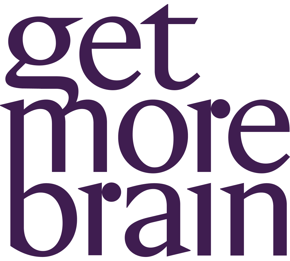
Our new branding removes the visual noise and focuses on what matters most – our name and our promise. The new logo is clean, elegant, and unapologetically straightforward. No graphics, no illustrations. Just “Get More Brain” in a refined wordmark.
Why? Because those three words already do a lot of heavy lifting. They’re our mission statement, our value proposition, and our invitation – rolled into one.
The symbolism is simple on purpose. By putting the full focus on our name, we’re saying: we know what we do, and we don’t need bells and whistles to prove it.

Same Mission, Elevated Experience
Here’s what hasn’t changed: our core mission to Transform your Content and maximize your Revenues.
We’re still the platform that turns PDFs, XML, and legacy documents into Smart Content – modular, searchable, interactive, and revenue-generating.
We still enable bundles, subscriptions, licensing, and white-label academies. We still help teams scale by connecting them with an ecosystem of publishers, partners, and distribution networks.
What’s different is how we show up in the world. Our new branding better reflects the professional, innovative, reliable partner you’ve come to depend on.
Welcome to the New Get More Brain
To our existing customers: thank you for growing with us. You’ve been part of the journey from the neon days – and we’re excited to keep building with you, now with a look that matches what we deliver.
To new customers discovering us for the first time: welcome. You’re joining us at a great moment. We’re the same company that’s been transforming content into revenue-generating assets for years – just with a more polished exterior and an even sharper focus on what matters to you.
You’ll start seeing our new branding roll out across our website and LinkedIn from now on. The platform refresh follows in January 2026. Our rebrand relies on the same powerful white labeling and designer tools we’ve built into our platform – tools that make it seamless to adapt the entire Get More Brain experience to match any brand identity. And here’s the best part: these same tools are available to our customers, giving you complete control over how your content platform looks and feels.
Here’s to Growth – In All Its Forms
Our original logo was about growing knowledge. Our new logo is about having grown.
We’ve evolved from an energetic startup into a mature platform that serious organizations trust with their most valuable asset: their content. But we haven’t lost our spark, our mission, or our commitment to helping you succeed.
So here’s to 2026 – less neon, more substance, same commitment to helping you get more brain.
Because at the end of the day, whether it’s lime green or deep purple, the promise stays the same: we transform content into dynamic digital assets that drive growth, create new revenue streams, and help teams scale.
Welcome to the new era of Get More Brain. We think you’re going to love it here.
